website redesign

UCalgary Wellness
I needed to build a new website for the centre, and wanted to give the users a better experience.
I followed a user-centred design process:
-
Understand the users and their contexts
-
Articulate the requirements (user needs and business goals)
-
Plan and prototype the site pages
-
Assess the solution's effectiveness
user research
data analysis
content auditing
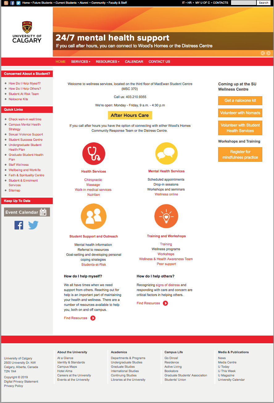
The Wellness Centre website homepage before the redesign project
The Wellness Centre website homepage before the redesign project
research and analysis
To understand the users' needs and context of use, I started with generative and evaluative research. I observed users become confused by the jargon, unable to complete top tasks, and frustrated with broken features, and outdated content. They also didn't like that the site was not mobile-responsive.
The overwhelming majority of users arrived on the contact page and bounced, which correlated with the high volume of phone calls the administrative staff fielded every day.
My content audit surfaced issues with confusing copy, accessibility, discoverability and navigability issues. Overall, the reputation of the centre was suffering and the poor website experience wasn't helping.
my research approaches
Generative and evaluative research included:
- a focus group with the Student Advisory Council to explore their thoughts and feelings about the service and its offerings
- usability testing with student volunteers to learn if they were able to complete key tasks, and how long these took
- a card sorting exercise to understand how the users expect the content to be organized and labelled
The user research participants were not what I would consider a representative sample because they were highly engaged with the institution's programming. Less engaged students were difficult to find and recruit.
Data and analysis approaches included:
- User Explorer in Google Analytics to assess pages per session and goal completions among users with a comparatively high number of sessions
- Technology and Device to understand which browsers users had and whether they used desktop, mobile or tablet
- Users Flow to understand common exit pages (whether or not there was a CTA to be had)
- Acquisition sources to understand how users arrived on the site
- Site content to discover the most commonly visited pages
- Google Search Console to understand the queries users searched most often
- Note: This was before Core Web Vitals became a big part of Google's algorithm
My content audit approach included:
- a big spreadsheet of each page, its metadata, content topics, stakeholder RACI, update cadence, content gaps, keywords, and high-level recommendations (retain, revise, retire)
- Performance metrics for each page comparing pageviews to conversion events, bounce rate, and SEO standings
My audit surfaced issues with the content lacking clarity, purpose, and a clear map to a user need. There was a lot of information that they wanted the user to have, without much consideration about what the users wanted out of the content.
The site had accessibility issues lacking operable controls for the image carousel, mobile responsiveness (table-based layouts), formatting for assistive technology, and alt-tags on non-text elements.
The structural issues included a deep navigation structure relying on a matrix of hyperlinks, and a lack of intuitive groups and labels. The site adhered to Conway's Law, as the navigation structure reflected the department's org chart (who cares? not the site visitors). It took some effort to convince stakeholders that there did not need to be multiple landing pages for workshops, depending on who was delivering them. That the user just wants to register for a session that meets their needs and get on with their day.
information architecture
user stories
content governance
planning
The users needed content that is:
- grouped logically with clear labels
- usable on all devices
- easy to navigate to accomplish key tasks — like booking an appointment or registering for a workshop
The stakeholders needed a website that is:
- accurate and up-to-date
- easy to maintain and edit
- able to generate leads for promotions
user stories
User jobs to be done
The users of the Wellness Centre website had a number of goals. I framed these around benefits to the user, rather than specific tasks to complete on the website. No user needs to fill out a form so they can attend a workshop, they need to get support to feel better. The user stories sounded like this:
"As an unwell university student, I need to see a doctor so I can get a prescription for medication."
Or,
"As a stressed student, I need to get mental health support so I can better focus on my studies."
information architecture
The Wellness Centre's information architecture was a challenge. I had to manage stakeholders that all wanted their information at the top level of the navigation level, despite the relevance to the user. There were a lot of similar programs run by different departments that all wanted unique landing pages for their stuff.
User research (card sorting and usability testing), surfaced user’s preferences for groupings and labels which informed the following changes to the navigation:
- “Health Services” to “Medical Services”
- The card sorting exercise showed that users preferred the term “Medical” to refer to the services provided by doctors, nurses, dietitians, and paramedical practitioners.
- The subpages for the walk-in and travel clinic were information light and the CTA for both was to call to book an appointment. This info was consolidated on the Medical Services landing page, rather than forcing users into a deep page (3rd level).
- Paramedical services (chiro, massage, nutrition) retained their own landing pages for information about the practitioners and intake forms.
- “Mental Health Services” kept its label
- I combined pages with similar info to reduce the number by half (6 to 3).
- I grouped similar services and retained counselling (psychology), advice (referrals), and support for students at risk of self-harm (social worker interventions).
- I combined and relabeled the Student Support Advisors (the practitioners) and Student Support and Outreach (the practice) pages. This became Mental Health Advice (the service provided).
- Brief Individual Counselling became just Counselling, and the expectation of duration and scope was set in the on-page content and during the intake process.
- Any service that was workshop/learning based or provided by peers (Online Self-Help, Wellness Workshops, Group Support, Relationship Seminars, Nutrition Workshops) was moved to Staying Healthy.
- All workshops and training programs were combined into Workshops and Training (Training, Workshops, Wellness Programs, Nutrition, and Wellness Workshops).
- All group therapy was combined and moved to Group Programs (Group Support, Relationship Seminars).
- Programs & Workshops and Resources > Staying Healthy
- I deleted a lot of this section
- The Health and Wellness Awareness Team was no longer active so didn’t need a landing page
- Wellness Resources was a shitshow with a 28-page Wellness Guide that had fewer than 15 page views per year.
- The content was dated and sometimes (like in the sex and sexuality, alcohol and drugs, and fitness sections) offensive, homophobic, and strange
- The videos and webinars were moved to Online Learning
- The Event Calendar
- was replaced by LiveWhale, an embedded events manager with a filterable results page
- Contact us
- Users found it hard to find contact information for specific practitioners so we created an Our Team page, plus what to do in an emergency after hours.
- Student Medical Response was previously listed under Services, but users grouped it with Contact info more often as it was more logical to them.
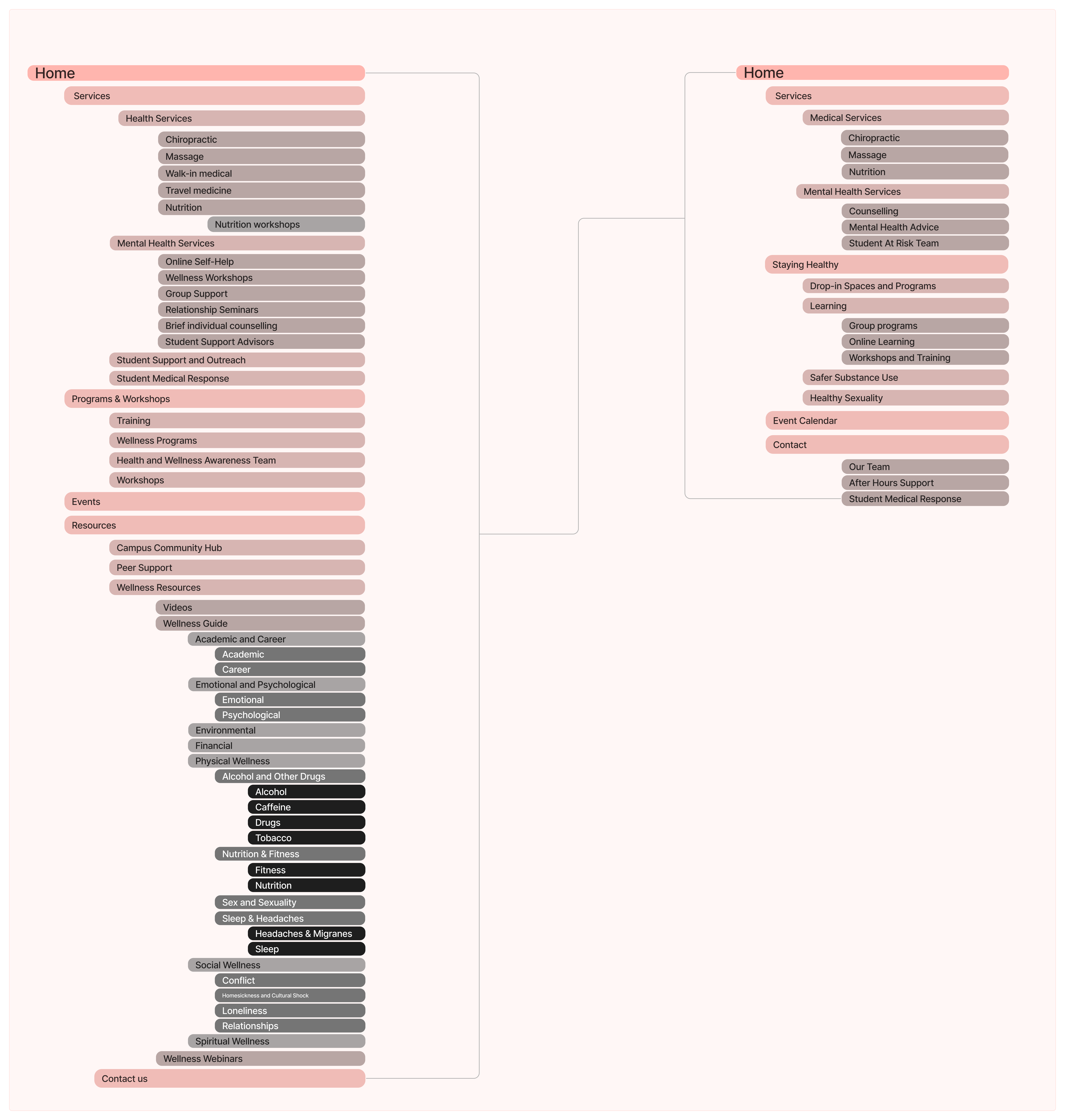
The before and after of the Wellness Centre main navigation
The before and after of the Wellness Centre main navigation
accessibility
copywriting
content management systems
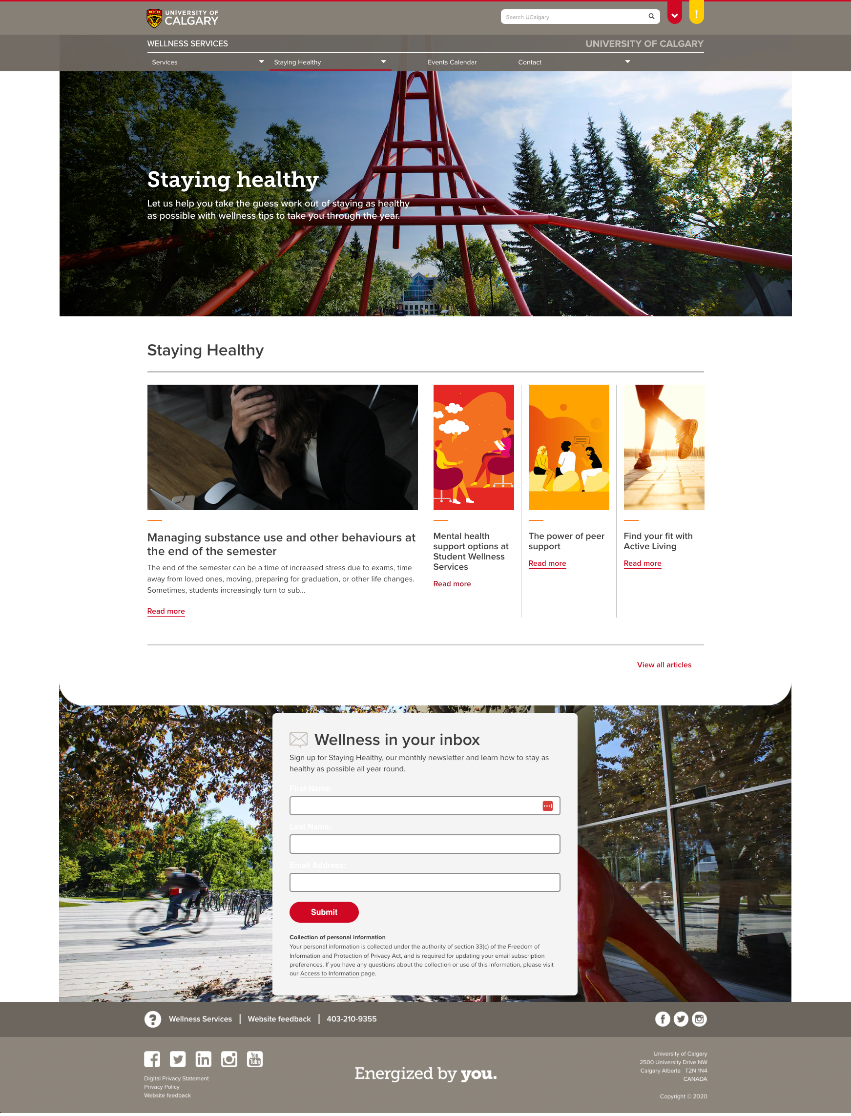
Staying Healthy was the content marketing strategy to promote the Wellness Centre's services
Staying Healthy was the content marketing strategy to promote the Wellness Centre's services
prototyping
When building out the website, my priorities were to:
- create logical content groupings and simple navigation
- meet WCAG 2.1 AA with an accessible and inclusive experience
- make key tasks — like registering for programs — simple and obvious
- use friendly, action-oriented, jargon-free language
- make the design mobile responsive
- generate leads for content marketing plan
building processes
Website design
The component-based CMS had a decent library of branded content blocks that could be pulled into layouts to design the on-page content. This made designing the pages simple, but I still templated similar page types in order to maintain a consistent experience.
Web content accessibility
Since one of the main issues users had with the existing site was its jargon and difficult information, ensuring all web content had a Flesch–Kincaid readability score of Grade 7 or lower was important. I didn't want to increase the cognitive load of users who are seeking mental health or medical care.
The on-page content was formatted for scannability and front-loaded with the most important information first. Employing the correct use of headings (h1-h6) enabled users accessing the content on assistive technology the ability to use it with ease.
Anchor text and CTAs were all written to be distinct and meaningful, and I did away with all tables.
Content strategy
The content strategy involved aligning content with these key goals:
- creating and maintaining consistent, clear, helpful content to meet user needs
- providing transparent information to improve the centre's reputation and trustworthiness
- increasing organic reach to earn more key conversions (newsletter sign-ups, workshop sign-ups, and appointment bookings)
I wrote clear, concise, and action-oriented content and documented the content lifecycle. This document had who required the content, its target audience and performance goals, how often it needed to be updated, and who needed to be consulted and informed.
I created a library of re-useable content blocks. By structuring the content for re-use, information like seasonal open times and contact information could be updated once and displayed correctly across the site.
To increase key conversions, I created a content marketing strategy called “Staying Healthy”. It was anchored around a blog with weekly wellness tips and event listings. The blog was supported by a newsletter, with content repackaged for social media. The purpose was to ensure consistency in digital interactions, to be useful and engaging, and to grow the audience. I integrated a newsletter registration form (Marketo) into the site to capture leads, growing qualified leads by 25% month over month for the first six months.
Embedding a new event management system (LiveWhale) enabled greater efficiency in the promotion of available programming, with sign-ups and email communication handled in-app, and all upcoming programs categorized in a closed taxonomy and displayed in a user-friendly calendar view. Before this, I would have to write HTML descriptions of each event to show in a custom calendar view. Then users filled out a form on the website, and the event host would have to download a CSV of registrants and upload their information to an email client to send confirmations or pre- and post-event communication.
I created an SEO strategy to increase their organic traffic. Creating a mobile responsive site, optimizing images, and writing keyword-optimized metadata enabled the site to rank first for each of the target search terms and long-tail phrases. The blog content helped improve E-A-T for human quality ratings, supporting the goal of trustworthiness.
content marketing
measurement
reporting
performance
Usability tests showed improvements in time to task completion and successful task completion.
The on-page SEO strategy, as well as taking control of the Centre's Google Business profile helped improve E-A-T and enabled first-page rankings for target keywords.
The content marketing strategy, Staying Healthy, saw newsletter registration grow by 25% month over month for the first six months.
in summary
Overall, this web redesign gave the users more of what they needed; a mobile responsive website, clear labels and terms, and straightforward navigation so they could find the information they needed with ease. There were still barriers to an optimal user experience, such as an online booking functionality.
