UX writing
How I design content for financial products
AI/ML products
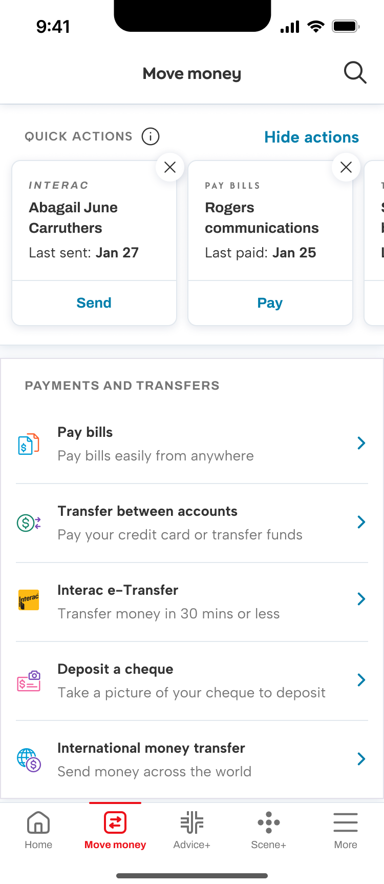
Quick actions
Product powered by machine learning, algorithm observes and predicts common actions based on user’s behaviours. It was important to me to describe the feature, but not name it.
Content principles are giving enough information to be transparent (but not creepy), and to give enough control over the actions that the user feels like they’re being assisted not controlled.
Enough information
Default state. The user will be presented a carousel of brief cards at the top of their move money page, with just enough context to pick an action.
Empty state. Gives enough information about what quick actions are and why there aren’t any shown at the moment.
Tooltip active state. I describe the feature as an analysis of behaviours rather than as AI/ML and framed it around the benefit to the user.


Enough control
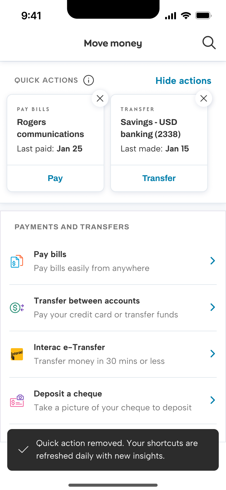
Confirmation message. Users can remove actions using the close icon. I chose to disclose that the actions are updated on a regular basis, in case the same action appears again.
Modal. When the user selects “Hide actions” they can remove this section all together. This is one of the first personalization features developed for the Scotia app. We add a card to bottom of the move money landing page with the CTA to show the quick actions again.
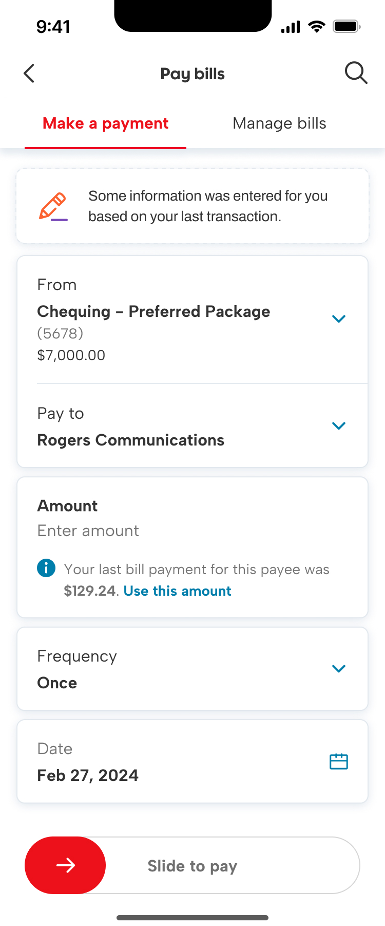
When the user clicks on one of the cards, it starts the task flow for that action. Here, we’ve initiated the bill payment flow, and populated some but not all info. We also disclose that we’ve done so, for transparency.

LLM assisted search (proof of concept)
On Scotiabank.com, we have a static, keyword-based search function powered by Solr. The semantic match between the search intent and the returned results needed improvement, and search results often returned hundred of pages. To improve the discovery experience for users doing product research, we designed a generative AI assisted search function to test out on the unauthenticated website session in partnership with BDO using Microsoft’s OpenAI-based LLM.
Our goals included making it easy to find product info, enhancing client satisfaction and loyalty, increasing sales and conversions among potential clients, and differentiating our web experience from competitors.
Guiding the outputs
I used the same framework from my persona work for chatbots to define the key attributes of the tool, which were formatted into a Json metaprompt.
The interaction goals were to be accurate, easy to understand, and make it easy to take the next action in the sales funnel.
Scotia has established brand guidelines for personality and voice, but I needed to adapt those into attributes suitable for an artificial agent.
I developed character traits including helpful, clear, and knowledgable to be expressed in a calm, conversational, and factual tone.
Content principles
I developed a set of content principles to assess the quality of the outputs.
Accurate. Accuracy was critical to build trust inside Scotia that a machine could generate content for clients. We trained the tool on the website content and constrained the responses using retrieval augmented generation.
Transparent. The outputs all included links to the source of the information so the user could verify the details.
Practical. We wanted to help prospective clients find product info and convert, so the outputs should include sales funnel actions (book an appointment, open an account, etc.) whenever relevant.
Key behaviours
Do’s and don’ts. Do provide information with links for more details, use plain language, use pronouns “you” or “we” for the client and the bank. Do not provide financial advice, compare Scotia products to other banks’, or recommend specific products directly.
Confidence. We constrained the tool to use explicit and implicit confirmations when the confidence match was medium or low, to ensure the user had a chance to correct any mis-match with their intent.
Handoffs. As with our in-app chatbot, we planned for scenarios where the tool would hand off to chat or phone agents, or book an appointment with an advisor.
Outcomes
Trust. We discovered that most users did not visit the source and trusted the tool generated accurate information.
Human interaction. Users were fine to use the tool when researching, but when they were ready to conver, they often booked an appointment. We found the human touch was important to close the sale.
Navigation. Many of our site visitors used search to navigate the site. Our tool wasn’t the best fit for this use case, as the conversational nature became friction in these wayfinding interactions. If we implement this feature after the PoC, we’ll need to design for wayfinding intents.
Making banking easy
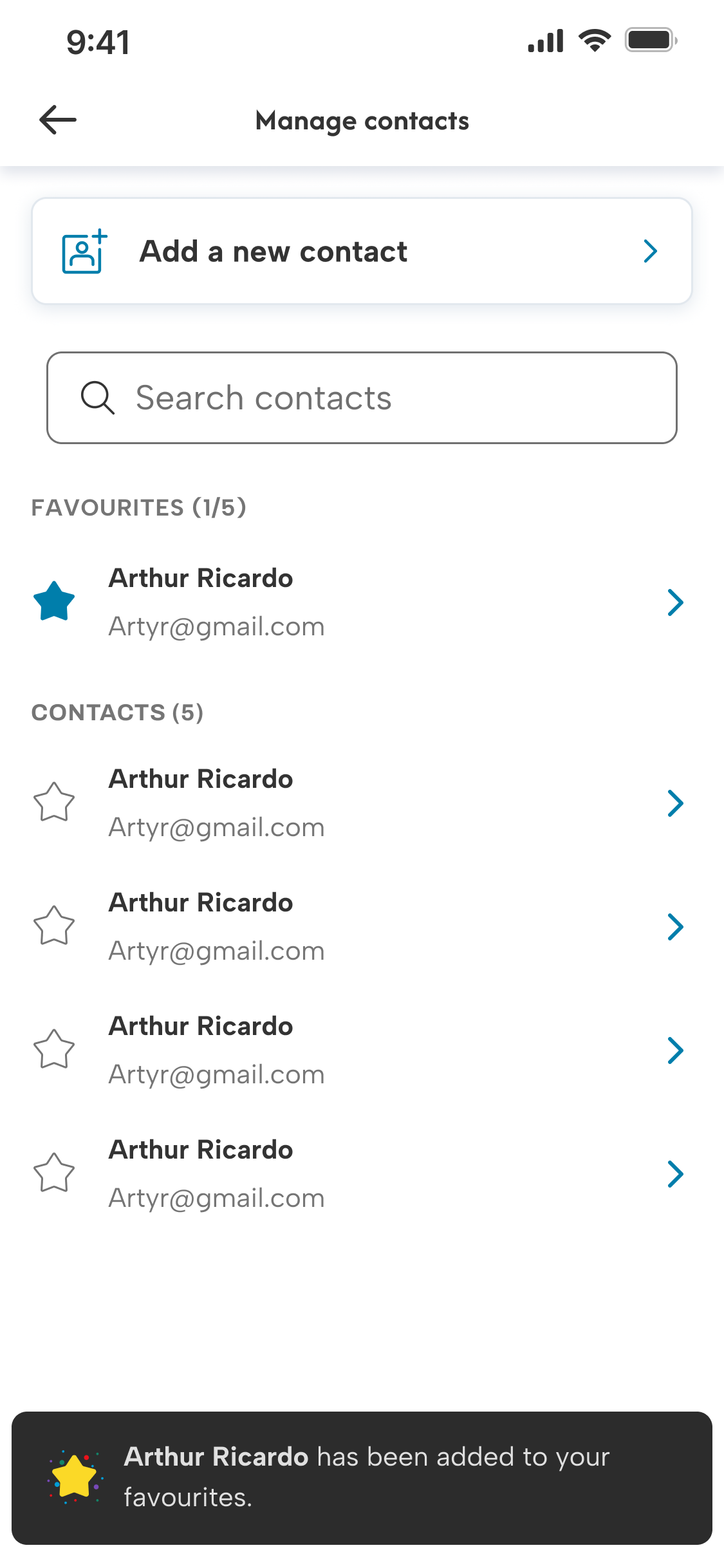
Fav contacts
A first in Canada. We enabled users to save their favourite contacts, so they can quickly access the people they send Interac e-Transfers to most often. In the first 3 months, we had 2.5 million contacts favourited by 800 thousand users.
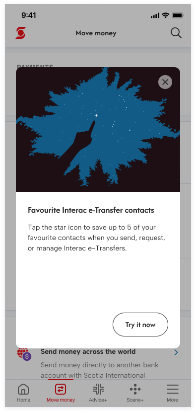
To help users discover the feature, I wrote a coach mark that appears on the move money landing page of people who have saved contacts.
The user can favourite contacts anywhere they access their contact list. When they have no favs, I used the empty state to provide instructions.
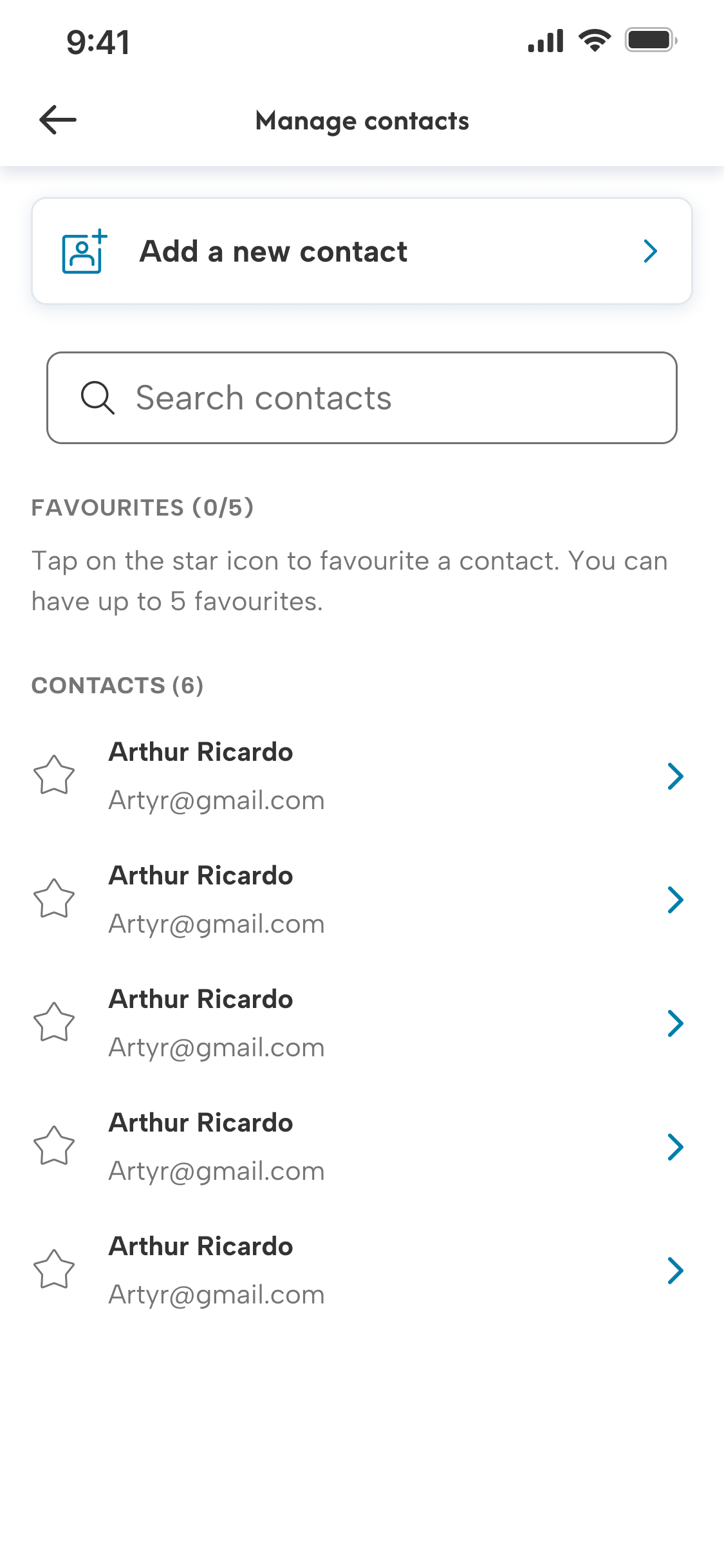
When a fav is added/removed, we have an animated confirmation. Favs are separate from other contacts, with the number in the list for accessibility.
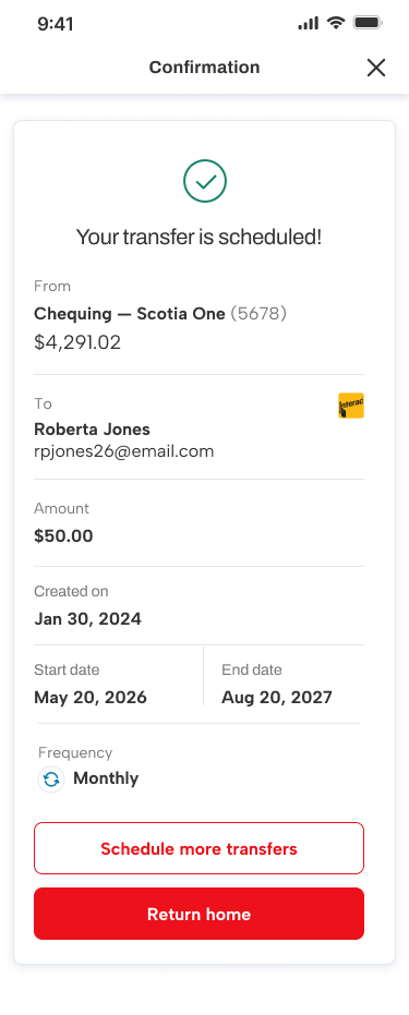
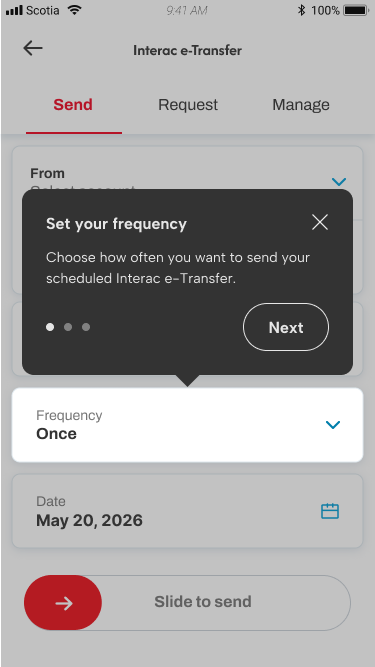
Scheduled and recurring
Canadians send over 1 billion Interac e-Transfers each year. Frequently, the transfers are identical (like rent). Giving clients the ability to schedule future-dated transfers, or recurring transfer series isn’t a first in Canadian banking, but an important piece of functionality to have in order to maintain client primacy.
Scheduled and recurring e-transfers content principles included contextual discovery, reusing existing terminology and patterns, and progressive disclosure.
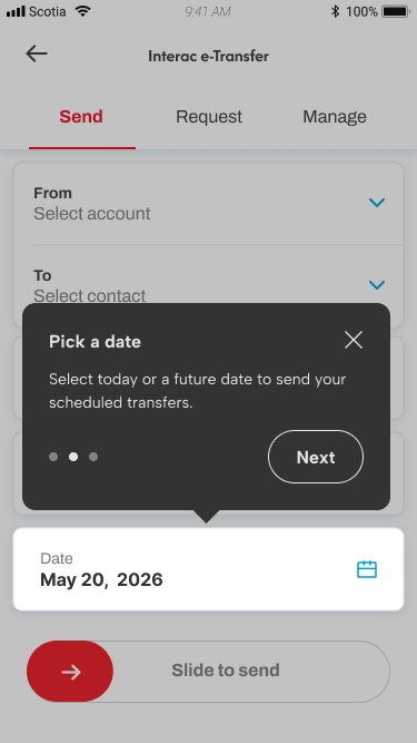
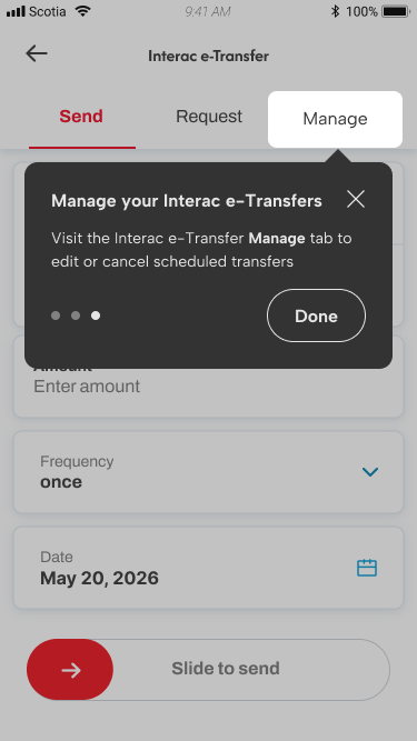
Contextual onboarding
The onboarding tutorial was triggered in-context when the user navigated to the Interac e-Transfer landing page, demonstrating their intent to send a transfer.
Avoiding being too disruptive to the user’s task with the coachmarks, I kept the tutorial to a few key changes, with the ability to exit the tutorial at any time.
We knew from user feedback that the Manage tab was challenging for users to discover, so we included where to find the edit or cancel scheduled transfers in the onboarding.
Progressive disclosure
Users sending a transfer will begin with the default experience, with one-time as the default frequency.

They can change the frequency to another option if they want to have a recurring transfer.
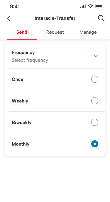
When a recurring frequency is selected, they will now have more input fields to select options for.
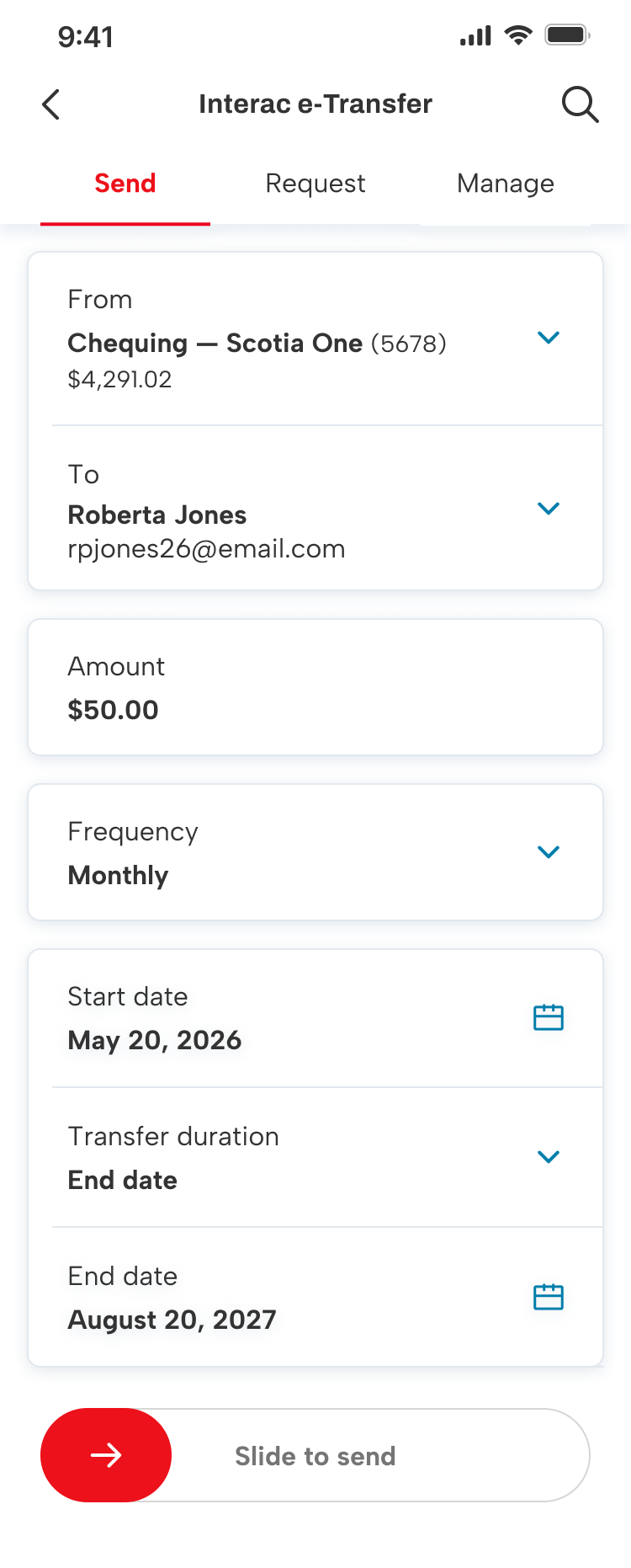
Once they’ve finalized their transfer, they’ll get the existing confirmation screen, with a few contextual updates.