
Case studies
A deeper dive into my projects

Product naming
When does a new feature deserve a name?
Apps like Venmo and Splitwise for bill-splitting and reimbursing money are popular among young adults. Banks and fintechs in Canada launched similar functionality; RBC has Split with Friends, BMO has SplitShare, even PayPal added some bill splitting functions. Interac e-Transfer has a massive share of this market in Canada, with millions of transfers sent and requested each day.
To increase revenue, we need easy to use features that enable our users to deposit more money.
Task
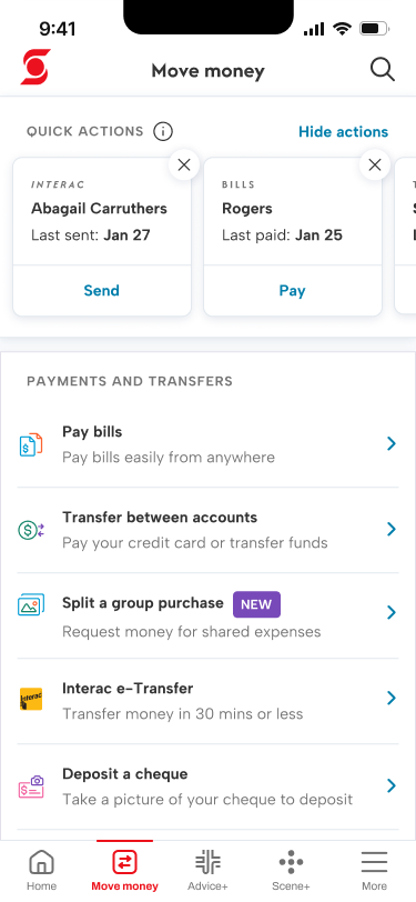
We designed a feature for our mobile app to enable users to calculate and request money from their contacts for shared expenses. Increasing Interac e-Transfer requests means more money comes in to the bank, which aligns with strategic priorities to grow deposits.
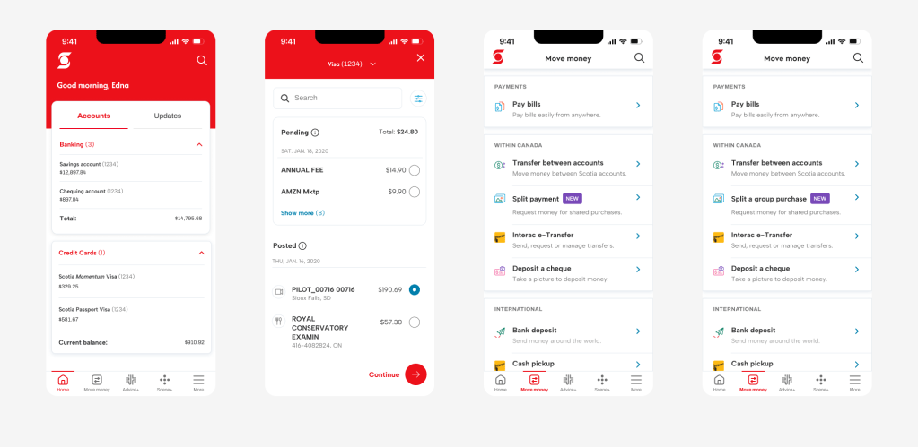
Users preferred to select a transaction from their transaction history to split over having a designated entry point on a landing page in the app.
Action
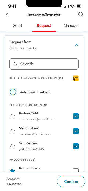
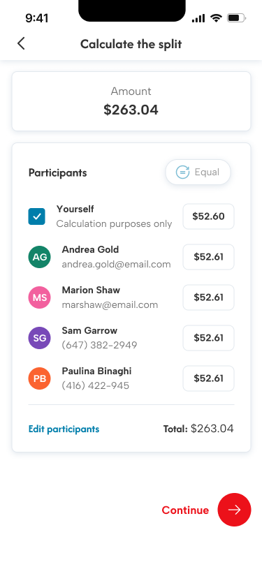
I led content design and strategy, collaborating with a product owner and designer to design and test iterations of this feature with users from our target audience. I researched, wrote, tested and iterated on the content hierarchy, labelling, and navigation to make sure it was easy and intuitive to select and calculate amounts to request from multiple contacts.
Through usability testing, we learned users found the tasks easiest to complete when:
- we described the feature instead of naming it
- we made it clear the featured used Interac e-Transfer to request money
Business and product stakeholders had the opinion that since other banks had product names for their bill-splitting features, we should compete by coming up with a distinctive name. In our prototype iterations, I tried adding onboarding help for the feature. They still found the named feature — Split payments — unclear. When I described it as “requesting money from a group”, they were far more confident and able to find and complete the tasks with ease.
Results
In my experience, named features are more complex to write about and explain, so I wasn’t surprised our research showed a user preference for descriptive language over proper nouns.
I was able to convince my stakeholders to drop the product name by presenting the research findings supported with direct quotes from users. We had a new buy now, pay later feature that was significantly underperforming expectations. Client feedback was that it was hard to discover in no small part due to the name, “Scotia SelectPayTM“, which gave no indication what it is.
Being descriptive, so that users can bank without learning new terms, is crucial for building customer-centric products. People don’t want to engage with their banking app, they want to do a task and get on with their lives. As a content designer, my job is to push back on vanity metrics (like product stickiness) and advocate for users’ best interests. This project is one small example of how I do this in my work.
